Sommaire
We have just carried out the preliminary adjustments of the development of the image.
In the previous chapter, we have seen that it is up to the photographer to adjust the color of the lighting (White balance) and to indicate to the software the luminous tone that he / she wants (Exposure compensation). By balancing the contrast, the Smart Lighting assisted him / her to define the essential light ambiance of the image.
Sit back and consider your image.
At this point it has the main things of its nature. It is important that it has the expected tonal balance.
With experience you will already anticipate the contribution of future corrections that will give it its character.
The Selective Tone
This set of corrections makes it possible to balance the general luminosity of the image according to three tonal ranges and, in fact, intervenes effectively on the contrast and the feel of sharpness.
Highlights
Use the slider in the positive direction to make the image brighter.
In the negative direction to limit clipping and restore detail to areas that are too bright. E. g. by blurring the too sunny spots of a landscape.
Midtones
This is another way to act on the overall contrast while maintaining the extreme tones that serve the bright atmosphere of the image. Here we seek to isolate the subject from the background.
Shadows
The automatic metering of mid-range cameras is set to preserve the bright areas of the scene. Under certain conditions, the photo is underexposed. A common action is to unblock the shadows, i.e. to lighten up them in order to reveal the details they contain.
Remember that the raw file has a much higher intrinsic dynamic range than the direct JPEG image.
Blacks
This slider establishes the threshold (also called the black point), i.e. the border between black and something. The user decides that pixels below a certain light output will be black.
The negative values will give depth to the image without darkening it. The positive values are rather intended to stretch the range of nuances of a large too dark area.
The use in the positive direction is more rare.

The Selective Tonality is the correction to be carried out very carefully. It is also the one to which we return to depending on the effect given by the following corrections.
Smart Lighting has equalized the image according to technical constraints. It is now necessary to give it the desired character.First treat the subject of the photo and the important elements as well as possible, then return to the secondary details after having lowered all the corrections in the “Basic Tools” palette.
See the tutorial “Efficiency with PhotoLab – Selective Tone“
On photos with complex shooting conditions, it is sometimes useful to play with Exposure Compensation to assess recovery potential. The sky and the bright areas are the delicate regions that can be irreparably damaged during the shooting. On the other hand, the resources of the raw file are impressive for finding material in the shadows.
Keep an eye on the histogram to understand the behavior of the software with this image (it should change shape quickly). Then bring the Exposure Compensation slider back to the initial choice that suits the image using the PhotoLab correction history.
We know that the selective tone correction has been properly used when the values of the first three sliders are not all positive or negative. If they are all activated in the same direction, it means that the exposure compensation or even the contrast has not been beforehand optimally adjusted.
A trick to learn how to master this set of corrections is to extend the whole range of luminosity, from black and deep shadows to bright white on an image without any particular atmosphere (scene lit by a sun slightly veiled in the back e. g.) in order to understand the influence and latitude of these corrections.
One way to obtain images to your liking while ensuring the quality expected by the future viewer is to standardize it, i.e. to make it perfect according to the established canons before customizing it. Thus the technique defining your style will start from an image without technical defect instead of trying to correct for them while wanting to express your will. Then you will know how to pass this stage.
When we have gone through with all these corrections and are still unsatisfied, it is time to look at Local adjustments.
The DxO ClearView
The reduction of the veil exists on other software. PhotoLab proposes an exclusive treatment which is a concentrate of accentuation, of the MicroContrast particularly, doubled by an increase of the saturation of the colors. Here again it is not a recipe to be dosed with sliders but an analysis of the image coupled with a specific treatment using particular algorithms.
It is not possible to reproduce the effect of ClearView by combining various conventional corrections.
ClearView should only be used for the purpose for which it was intended. There are four situations where it can be used.
– Humidity in the air veils a panorama taken in the middle of the day in summer
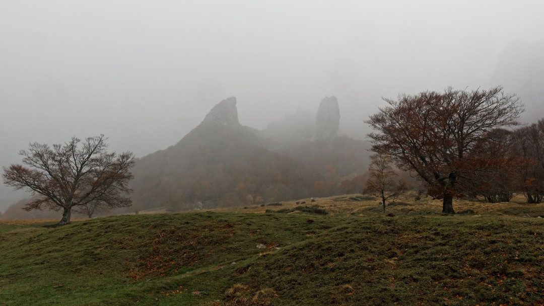
– Fog will veil the picture and make the colors look dull
– A light source or reflection in the field has dazzled the sensor
– A low-angled light fell on the front lens element of the lens. The contrast has collapsed and the photo has a milky appearance (flare)
Apply the ClearView by decreasing its Intensity to the lowest possible value according to the four situations. Indeed, it does not seem advisable to cancel the effect of the fog which participates in the atmosphere of the scene, or even which motivated the triggering.
One should always question the ClearView correction by taking a critical look at the image a little later. You tend to overdo it (and the default 50 value is already too high) and lose the naturalness of the scene.
Another mistake is to activate it to quickly accentuate the image and saturate the colors for a pleasant rendering, which makes you lose control of the correction and increases the risk of artifacts appearing.
Artifacts are rarely a weakness of the software’s algorithms but are due to the user forcing the sliders move too far.

The ClearView is offered in the “Basic Tools” palette after the selective tone correction. It could be placed before, according to the user’s practice, he has identified the situations in which to apply it.
The proper use is to move from one correction to another to find the balance.
Finally, if the ClearView is primarily intended for landscapes, its application has interest on portraits of character by revealing wrinkles and roughness of the skin.
The Contrast
The contrast setting serves several purposes.
– To give impact to the image to strengthen the subject
– On the contrary, to bring softness to the image
– To express the opposition of values in the image (textures, wrinkles or smooth skin for a portrait, dark / light areas)
– Enhance a soft lighting because the photographer was dependent on the light of the moment
– Increase the impression of sharpness in the image
This basic setting is called Global Contrast because it is intended to be applied evenly across the image. Raw development software approaches contrast adjustment in several ways with other tools (MicroContrast and color saturation) that are more appropriate for different situations.

PhotoLab automatically adjusts the contrast with Smart Lighting making this slider unnecessary.
If Smart Lighting is not used, the Global Contrast setting should be reserved as a prerequisite for future corrections, thus contradicting the rule of lowering the corrections in the “Basic Tools” palette.
Its use is basic. In a positive sense, it densifies low-contrast photos. It will especially darken outdoor shots while risking to burn the sky. Activated in the negative direction it softens a portrait.
By adjusting the overall contrast the novice user often focuses on one part of the image to the detriment of the others. Be sure to keep a general view of the whole image.
The MicroContrast
This option of the contrast setting, also called local contrast, is used to reveal micro-details that contain a lot of information and to densify the image by giving substance to flat areas.
The principle is to accentuate the outline of shapes, it acts on groups of pixels of similar hue and color compared to the rest of the region where they are located. Only the contrast and color saturation of these small areas are modified without affecting the overall area.
By activating MicroContrast with the magic wand PhotoLab makes a proposal that takes into account the performance of the lens and the lighting conditions that it deduces from the triplet speed aperture sensitivity (ISO speed).
Note that the automatic value of MicroContrast (magic wand) is limited on the areas with automatic detection of faces of Smart Lighting.
The plugin “DxO FilmPack Elite” offers a variant, the fine contrast which will act only on the edges of these areas for a smooth impression of sharpness.
In the end, the MicroContrast contributes significantly to the impression of sharpness.
It allows the creative accentuation of the image according to its purpose. It should not be confused with the optical sharpness (in the Detail palette) which is a technical enhancement of the quality of the photo.
Applied in the positive direction, MicroContrast is the best tool for giving precision to the image. Be careful not to force the slider, the whole image quickly takes on an unpleasant grainy appearance.
By imposing a negative value, it blurs the defects of the skin on a portrait.
See a variant in the tutorial “Efficiency with PhotoLab – Fine Contrast“
The Color Accentuation
Saturation expresses the intensity of colors. This correction consists in making more present the colors dulled because of a poor lighting or a reflection, or to weaken them to obtain pastel tints.
Vibrance is a variant of saturation that will only adjust the colors that are not very saturated and thus avoid clipping colors that are already saturated. It is used mainly in the positive direction.
In fact the vibrance acts on the common colors of nature, mainly the blue of the sky and the greenery. It is suited for landscape photos where it is often appropriate to increase vibrance while reducing saturation.
It also prevents excessive saturation of the skin of the people photographed.
The accentuation of colors is mostly a matter of taste, sometimes fashion. The beginner tends to have the hand too heavy. It is not useless to come back to your image some time later with a fresh eye.
Perhaps one day you will assert your style with saturated color images to give them vivacity or, on the contrary, desaturated towards more or less cold pastel tones.
The Color Adjustment
Each camera model has its own way of rendering colors. Similarly, each software has its own specificity in their treatment.
For the amateur photographer the colors are a personal matter with which he can afford to take some liberties. It is different for photographers of works of art and all those who are asked to render the objective reality of colors (marketing, advertising, …). They have no choice and must deploy significant technical resources during the shooting to meet this requirement.
The actions to reduce the contrast of a strongly lit scene tend to increase the apparent saturation of the colors of the image.
On the other hand, in low light conditions the colors are naturally pale and one may feel the need to enhance them.
If the density corrections (Contrast, MicroContrast and color saturation) produce the expected result for brightness and contrast, it is often at the expense of the color that must be restored as much as possible. This arrangement with the reality of the scene answers the need for photographers to show their subject in its best light.

A trick for more pleasant images is to warm up the colors by shifting the white balance a bit.
Better yet, warm up with the DxO FilmPack plugin which offers an admirable tool, the warm tone filter (as well as the cool tone filter) which warms up cool tones without distorting already warm tones by yellowing the whole image.
For the adjustment of colors we distinguish between adjustment and modification. With the first photographers aims to reflect their reality while with the second he will transform it.
The HSL wheel (Hue Saturation Luminance) in the Color palette allows you to control the brightness and saturation of each channel independently. Without necessarily wanting to change the color of an element (which is fun to try), it is a great tool to harmonize objects and change the color ratios that unite them (or differentiate them).
See the tutorial “Efficiency with PhotoLab – Color Adjustment“
PhotoLab also offers several Color rendering tables to choose from before correcting the image.
See the tutorial “Mastery of PhotoLab – Color Rendering“
Noise reduction
When the lighting of the scene is weak the lack of light is compensated by increasing the ISO speed. Specifically it is to amplify the electrical signal received from the sensor. The noise is generated by the electronic components of the latter leading to a degradation of the signal.
Furthermore, the attenuation of colors and the loss of sharpness of details are already perceptible to the naked eye. The camera which does not have the flexibility of adaptation of the eye is quickly sensitive to it. The lack of dynamic range means that the recorded photo does not have the usual quality.
Noise is a parasite polluting the image at the pixel level. It breaks the light homogeneity expected in a region of the photo of similar density. There are two types of digital noise.
– The noise consisting of colored points arranged randomly is called chrominance noise. It is relatively easy to remove by analyzing neighboring pixels.
– The luminance noise results in pixels more or less bright giving a grainy appearance to the whole. It merges with the texture of the subject photographed. Its removal is more complicated and can lead to the loss of details.
The light areas are much more detailed than the dark ones. The signal from the low values is amplified to be recorded properly. Thus, even at moderate ISO sensitivities, dark areas can be subject to noise.

The addition of these difficulties results in a flat image, low contrast and lack of detail, or polluted by extraneous shapes (artifacts). Photographers’ desire to brighten their naturally dark image leads to the emphasis of all these defects.
Usually the noise reduction algorithms of the development software cause a further loss of precision. This is not the case with PhotoLab which, on the contrary, with its DeepPRIME processing, combines it with an enhancement of the details for an amazing result.
See the tutorial “Mastery of PhotoLab – Noise Reduction” for all the details on the application of this correction.
The PhotoLab main preview reflects the corrections made to the image except for noise reduction, no matter which mode is selected, where it always displays the correction made by the HQ (High Quality) algorithm. The particular operation of the PRIME and DeepPRIME modes does not allow live display.
However, keep in mind to remove only the noise unacceptable according to the desired use of the image. An image published on a digital medium is less sensitive to noise than a print, especially if it is large and intended to be viewed from a distance.
Horizon levelling
Depending on their sensitivity to the natural elements, the viewer tolerates more or less the lack of respect for horizontality. For the lack of sea horizon, a common joke among photographers refers to the “sea that empties”. Some ignore this phenomenon which is unbearable for others.
This correction is called the horizon, but it also concerns the verticality of buildings. Indeed, in landscape images, horizontal vanishing lines obey the laws of perspective, while vertical lines remain so visually.
An experienced photographer detects even the smallest error. It is important to remedy this defect as soon as possible in your photographic process.

With its magic wand, PhotoLab makes this correction automatically and very efficiently, preferably considering the verticals.
The grid (activated from the keyboard with the Ctrl/Cmd+ G keys) allows you to check if the correction is perfect. If it is not, it must be fine-tuned manually.
See the tutorial “Efficiency with PhotoLab – Horizon“
PhotoLab automatically straighten perspectives.
Dxo offers a software dedicated to perspective, DxO ViewPoint. It can be integrated into PhotoLab as a plugin.
See the tutorial “Efficiency with PhotoLab – Perspective with ViewPoint“
Cropping
The photo frame has varied a lot during the twentieth century to adapt to the variety of different formats of negatives that have been used. So the evolution of technical means has led to fashions and even practices that have remained. Some uses remained, such as the square format for portraits, or the modern use of 16:9 for landscapes.
The almost free nature of digital photography shooting can encourage us to shoot too quickly and, consequently, to lose the time saved on the search for the right framing, to finish the composition of the image during the development. If we add to this the exceptional quality of the raw photo of modern cameras, we can say that software cropping is part of contemporary photographic practice.
Some photographers believe that THE photo is the result of the precise frame captured at the right moment (Henri Cartier-Bresson spoke of the decisive moment). They refrain from cropping and limit their releases. This is an irrelevant comment here but a real controversy. It is certainly a formative exercise.
Associated with cropping, the composition of the image is essential. The care given to the latter leads de facto to a controlled frame that the photographer decides at the time of shooting, e.g. anticipating the 16:9 format by using a camera delivering photos with a 4:3 ratio. In front of their screen, they will constrain this ratio as he had envisaged it.
The “Ratio” option is there for that. Choose one of the current ratios or enter a value (or a fraction) in the edit box.
See the tutorial “Efficiency with PhotoLab – Cropping“
Local Adjustments
Local Adjustments meet two main needs
– Distinguish (or blur) certain areas of the image that are incorrectly rendered (not enough or too much present) depending on the shooting conditions
– Differentiate the areas where corrections are applied to reinforce the desired expression in a creative process
The Local Adjustments repeat certain corrections applied previously but on a dedicated area, a mask, defined by the user.
The objective is to highlight the subject by fragmenting the image.
With PhotoLab, you should prefer global corrections made beforehand because their action is more subtle and their application to the whole image respects the atmosphere of the shot.
The user spontaneously has in mind to strengthen the presence of the subject even though they should rather decrease the importance of secondary elements.
It is therefore more qualified to optimize the image to highlight the subject before using the Local Adjustments.
Finally, the position of the masks is static. It is insensitive to geometric corrections, horizon and perspective corrections, which must be applied previously. This is another reason why they are only addressed at the end of the development process.
Some photographers who started photo development a long time ago, on old generation software, and from photos coming from much less powerful cameras than today, consider local adjustments as indispensable and even start their processing with these commands.
This is a mistake that makes irrelevant the assistance offered by PhotoLab and these tips often lead the novice photographer into dead ends.
Local Adjustments are powerful tools towards which it is necessary to avoid rushing at once. The predecessor of PhotoLab (DxO Optics pro) did not have them. Paradoxically to the real evolution of the software, we notice that they are sometimes at the origin of degraded images by the user.
Once again I take this position by distinguishing two photographic approaches; objective (trying to render reality) and creative. The second one justifies without reserve the use of local adjustments.
It is the greatest care given to the shooting that ensures the success of an image, then PhotoLab is exceptional to give it the desired character.
See the tutorial “Local Adjustment in PhotoLab“

Exporting photos
The final goal of the photo processing is to deliver a publishable image, generally in JPEG format. It is THE universal image format; very common and efficient by its quality / size ratio. Its indisputable qualities must be relativized to its main defect, we will say rather its characteristic; the image is compressed. To express it in a sentence; the process of JPEG generation gathers the neighboring and comparable pixels in a common definition in a quasi invisible way for the viewer in order to reduce the size of the file and, consequently, to improve its display speed.
This compression process leads to a more or less reduction in detail, the absence of which becomes problematic when the purpose of this file is to post-process it with a raster image editor (PhotoShop, Affinity photo or GIMP for the most common).
For this purpose, other formats than JPEG are proposed, TIFF and linear DNG, which is necessary to keep in mind that the information of each pixel of the original photo, preserved and fully re-editable
To distribute the image, the large number of pixels of the original photo is not always necessary. By reducing the definition of the image, the greater discrimination of neighboring pixels puts less strain on the compression process. The lighter image retains its potential better.
It is therefore wise to impose just the definition just needed for the use that will be made of the image and limit the compression by selecting a quality of 90 or 95%. This method radically reduces the size of the file.
The definition is expressed with the “Dimensions” parameter in the third section of the export window options.
The compression rate is expressed with the “Quality” parameter in the first section of the Export to JPEG window options.
Finally, the resolution is a often superficial piece of information that leads to misunderstanding.
See the tutorial “Efficiency with PhotoLab – Exporting photos“
Once the development of the photo is completed, the image can exist in different forms.
– the original raw file which we advise you to keep for future use, new way of presenting the image, as well to take advantage of the constant evolution of development software
– a full format (or large format) JPEG version intended for paper prints
– a JPEG version adapted to a broadcasting medium, e. g. 1920 x 1080 pixel HD screens
– a very small JPEG version (300 to 1080 pixels wide) and compressed (80 to 90%) for quick display on computers, web or email attachments.
– a TIFF version (full format) for post-processing software and art prints. Today, almost all software accepts the enhanced 16-bit version.
To the next page of this tutorial
TuToDxO.com – All rights reserved – tous droits réservés.


