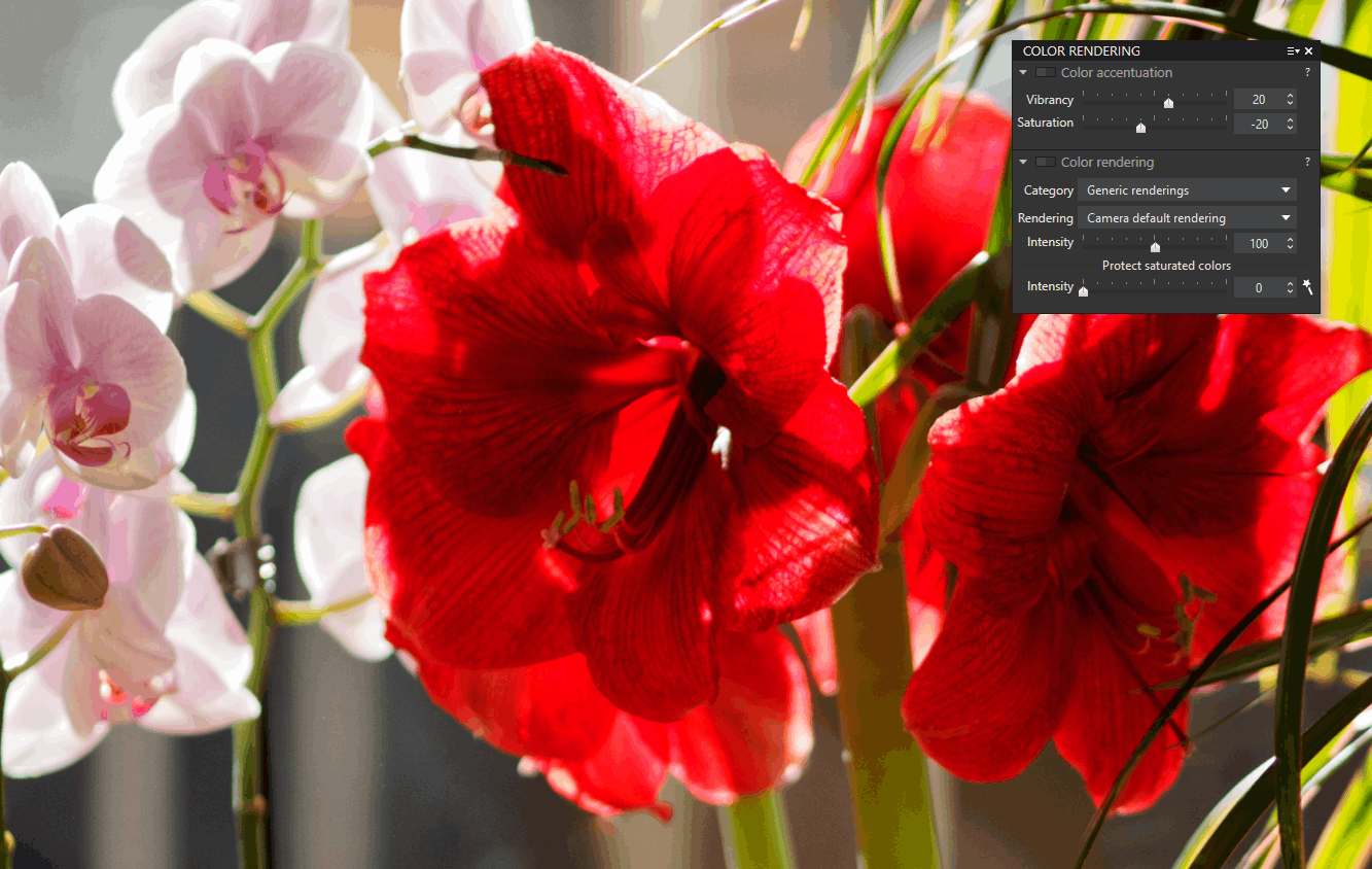
The main adjustment on the colors consists in intervening on their intensity in order to make them more lively, sometimes duller.
Color Accentuation
The adjustment of the Saturation is linear. It acts on the entire tonal range of the image. A 100% saturated color is pure, it does not contain white.
The distinction of PhotoLab’s Vibrance adjustment is to automatically limit the saturation on bright tints in order to avoid the clipping of the colors.
– In the positive direction, vibrance acts more strongly on the colors of nature, blues and greens
– Its action is limited on reds / orange as well as the flesh colors of portraits
– Vibrance does not act on folded colors (dark hues)
– In the negative direction, vibrance dulls bright colors only
In landscape it is often agreed to accentuate the Vibrance and soften the Saturation.
Thus the preset “3- Neutral Colors” made: vibrance +10, and saturation -10.
The interest of the correction of this palette is to intervene quickly for a small adjustment.
BEWARE. These two sliders should not be used in the same direction for redundant correction.
Saturation set to -100, the image is devoid of colors. The different hues of equal saturation and brightness are not discriminated against. Prefer the “4- Black & White” preset which is panchromatic.
These tools “Color Accentuation” are in duplication with another more discriminating algorithm accessible by the HSL wheel which dissociates the scope of the accentuation from the Saturation by channel of color.
Warm Tone Filter
This FilmPack adjustment is interesting when developing outdoor shots in poor sunlight. It facilitates warming up the images without shifting the white balance and thus all the corrections related to the brightness and the contrast.
* The warm filter lightly illuminates warm-toned areas (orange) and darkens cool-toned areas (bluish)
* There is also the filter “Cold Tone“.
My own preset prepares the Warm Tone slider set to 10.
– Activate the function by clicking the checkmark OR
– Start the adjustment to 15 by a Right Click on the left of the rail
Sepia Toning
The “Style – Toning” Sepia adjustment in the Color palette enhances the color effect in photos taken at golden hour or blue hour.
– Simple Toning, Sepia style
– Moderate intensity (10 to 25) to preserve colors
– Increase saturation if necessary
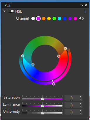
Color Adjustment – HSL wheel
Based on the color wheel, the HSL tool (Hue Saturation Luminance) allows you to independently adjust the Saturation and Luminance and modify the hue of a defined color channel to a custom amplitude.
The automatic selection of the range to be modified is carried out with the picker.
– Activate the picker in the center of the wheel
– Determine the amplitude radius of the measurement (Ctrl+ wheel)
– ENTER key to stop the picker tool
OR Manually select a channel button
The initial splitting proposed by PhotoLab is divided into sectors on the color wheel. But there are actually eight customizable channels available. It is thus possible to assign a completely different color range to a channel.
This alternative division must be performed without using the picker. Activating it later may override changes made to a manually adjusted channel. Be aware.
Tool use:
– Activate the picker and select a region
– The external handle allows you to change the color of the channel
– Act on the Saturation or Luminance sliders
According to this first overview:
– The external handles define the transition with neighboring colors
– Internal handles widen or narrow the range of tint to be adjusted
The division of the color wheel can be adjusted as needed (animation).
– Click held in the circle to shift the tint range to modify
– Double click in the circle to reset the hue range
– Double click on an external handle to reset the offset
– Double click on the colored button to restore the initial position in the chromatic circle
The illustration shows two different corrections on the green channel.
– The blue channel is shifted towards magenta then enlarged on the green side
– Secondly, the green channel is corrected
The action of the particular algorithm of this HSL correction gives a result different from that brought by the accentuation of the colors (see the explanation of DxO at the bottom of the page).
With HSL correction regarding the accentuation of colors:
* Saturation adjustment is more natural and smoother
* Saturation is contained for high values
* The range of the effect of the Global Saturation adjustment of the white button (master) is doubled
* Hue shift has less influence on luminance than its local correction counterpart
* The variation in Luminance of a channel has much less impact on Saturation compared to global correction of luminance

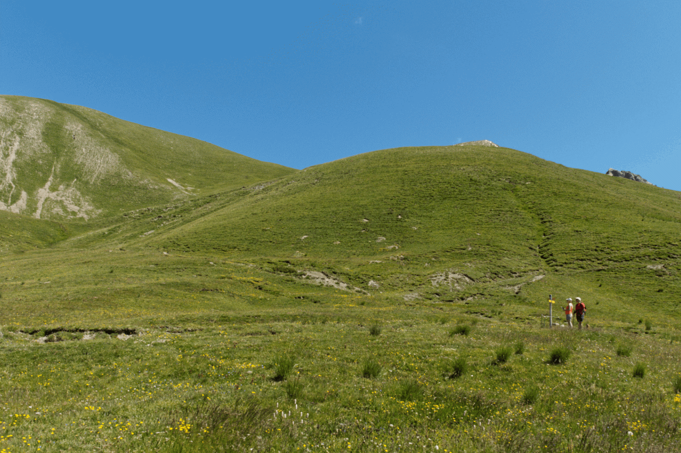
The illustration shows the use of the Uniformity adjustment, which spreads the range of greens in the vegetation.
The Uniformity slider equalizes or emphasizes variations in hue in the color range (at +100 it returns all neighboring hues to the selected one).
It is very useful for subtly blurring the redness in a portrait taken in natural light.
– Slightly shift the color of the red channel to orange
– Increase the uniformity of the orange channel
This technique allows a different approach to the “DxO portrait” rendering.
See the tutorial “Mastery of PhotoLab – Color Rendering”
* The area of influence of a channel can be visualized by holding down the Ctrl key and the left click of the mouse in a sector of the wheel.
– Wait a second to see the effect
* When the selection picker is activated, the scope of the quick comparison (Ctrl + D) is limited to color adjustment.
See the tutorial “Mastery of PhotoLab – Image Comparison“
* Switching to another correction (Contrast, Tone, …) when the picker is activated does not disengage the HSL tool. DxO thought that the user needs to adjust this correction and wishes to return to the HSL correction.
This tool in local corrections is terribly lacking.
According to DxO: The HSL algorithm is applied in a particular color space where the image is not represented in terms of red, green and blue as usual, but in terms of hue, saturation and lightness.
Refer to Wikipedia articles on tint.
https://en.wikipedia.org/wiki/Hue and
https://en.wikipedia.org/wiki/Tints_and_shades
It was very difficult to define where the green ends and where the yellow begins. The current boundary is a compromise that has been chosen to ensure that vegetation (grass, foliage) seen as green by the human eye will be considered green.
The Uniformity slider lets you make similar hues more or less equivalent.
Suppose a portrait where the skin must be (obviously) flesh-colored. Often, due to mixed lighting conditions or inhomogeneity of the skin, some parts are a little reddish and others a little yellowish. By adjusting one of the shade ranges (for example, orange) to match your model’s skin, and increasing the Uniformity, you get a nice skin tone.
The saturation on HSL (master / all channels) and the Saturation accentuation, in the Color palette, are different. They are applied in different color spaces and work slightly differently at different stages of processing.
TuToDxO.com – All rights reserved – tous droits réservés.